SharePoint React Components
This blog post will give an overview of an extension to the gd-sprest library for creating list item forms in SharePoint. The source code for this project can be found in github.
Project Overview
From all of the posts I’ve written so far, it just made sense to create an extension to the gd-sprest library for creating list item forms in SharePoint. The project uses the Office Fabric UI React framework to render the field components. This post will go over the test project, located in the github project. The test project is a simple dashboard to display the list items, with a simple menu for creating and viewing items using a panel.
Files
The test folder has the following files:
- cfg.ts - The configuration file to create the test list and custom fields.
- data.ts - The data source class.
- index.ts - The main entry point of the project.
- list.tsx - The list view.
- wp.tsx - The dashboard webpart.
Configuration
The configuration file uses the automation feature of the gd-sprest library. This configuration file defines the test list with the custom field types the gd-sprest-react library currently supports.
import { Helper, SPTypes } from "gd-sprest";
/**
* Test Configuration
*/
export const Configuration = new Helper.SPConfig({
ListCfg: [
/** Test List */
{
CustomFields: [
{
Name: "TestBoolean",
SchemaXml: '<Field ID="{E6C387B9-AA16-4115-B57F-601720F9D85B}" Name="TestBoolean" StaticName="TestBoolean" DisplayName="Boolean" Type="Boolean">' +
'<Default>0</Default>' +
'</Field>'
},
{
Name: "TestChoice",
SchemaXml: '<Field ID="{8B6EB335-3D5C-42B5-A2DB-601720E8A0BC}" Name="TestChoice" StaticName="TestChoice" DisplayName="Choice" Type="Choice">' +
'<Default>Choice 3</Default>' +
'<CHOICES>' +
'<CHOICE>Choice 1</CHOICE>' +
'<CHOICE>Choice 2</CHOICE>' +
'<CHOICE>Choice 3</CHOICE>' +
'<CHOICE>Choice 4</CHOICE>' +
'<CHOICE>Choice 5</CHOICE>' +
'</CHOICES>' +
'</Field>'
},
{
Name: "TestComments",
SchemaXml: '<Field ID="{0E11F904-4DA2-48E1-B45B-601720923498}" Name="TestComments" StaticName="TestComments" DisplayName="Comments" Type="Note" AppendOnly="TRUE" />'
},
{
Name: "TestDate",
SchemaXml: '<Field ID="{5BF47BE2-2697-47C1-B6FE-6017207B221A}" Name="TestDate" StaticName="TestDate" DisplayName="Date Only" Type="DateTime" Format="DateOnly" />'
},
{
Name: "TestDateTime",
SchemaXml: '<Field ID="{0F804508-A8F4-4DE6-9319-601720CE5294}" Name="TestDateTime" StaticName="TestDateTime" DisplayName="Date/Time" Type="DateTime" />'
},
{
Name: "TestLookup",
SchemaXml: '<Field ID="{ACF5F7EE-629A-452B-8381-60172088E176}" Name="TestLookup" StaticName="TestLookup" DisplayName="Lookup" Type="Lookup" List="SPReact" ShowField="Title" />'
},
{
Name: "TestMultiChoice",
SchemaXml: '<Field ID="{22AFA098-4B62-4236-8C01-6017208DAB49}" Name="TestMultiChoice" StaticName="TestMultiChoice" DisplayName="Multi-Choice" Type="MultiChoice">' +
'<Default>Choice 3</Default>' +
'<CHOICES>' +
'<CHOICE>Choice 1</CHOICE>' +
'<CHOICE>Choice 2</CHOICE>' +
'<CHOICE>Choice 3</CHOICE>' +
'<CHOICE>Choice 4</CHOICE>' +
'<CHOICE>Choice 5</CHOICE>' +
'</CHOICES>' +
'</Field>'
},
{
Name: "TestMultiLookup",
SchemaXml: '<Field ID="{68465DA3-34DD-4FEA-BE7A-60172019C4FA}" Name="TestMultiLookup" StaticName="TestMultiLookup" DisplayName="Multi-Lookup" Type="LookupMulti" List="SPReact" Mult="TRUE" ShowField="Title" />'
},
{
Name: "TestMultiUser",
SchemaXml: '<Field ID="{35C91E16-6C53-4202-B4AA-60172082983A}" Name="TestMultiUser" StaticName="TestMultiUser" DisplayName="Multi-User" Type="User" Mult="TRUE" UserSelectionMode="0" UserSelectionScope="0" />'
},
{
Name: "TestNote",
SchemaXml: '<Field ID="{0E11F904-4DA2-48E1-B45B-601720977191}" Name="TestNote" StaticName="TestNote" DisplayName="Note" Type="Note" />'
},
{
Name: "TestNumberDecimal",
SchemaXml: '<Field ID="{8EABA3DF-D439-4C78-B6E9-601720F7C222}" Name="TestNumberDecimal" StaticName="TestNumberDecimal" DisplayName="Decimal" Type="Number" />'
},
{
Name: "TestNumberInteger",
SchemaXml: '<Field ID="{02CD9CA9-2E41-42B1-B487-6017208731FD}" Name="TestNumberInteger" StaticName="TestNumberInteger" DisplayName="Integer" Type="Number" />'
},
{
Name: "TestUrl",
SchemaXml: '<Field ID="{9983709F-C54C-4816-AC2C-601720A0553B}" Name="TestUrl" StaticName="TestUrl" DisplayName="Url" Type="URL" />'
},
{
Name: "TestUser",
SchemaXml: '<Field ID="{041F5349-6D87-4DF8-8A7A-6017206F6F44}" Name="TestUser" StaticName="TestUser" DisplayName="User" Type="User" UserSelectionMode="0" UserSelectionScope="0" />'
},
],
ListInformation: {
BaseTemplate: SPTypes.ListTemplateType.GenericList,
Title: "SPReact"
},
ViewInformation: [
{
ViewFields: [
"LinkTitle", "TestBoolean", "TestChoice", "TestDate", "TestDateTime",
"TestLookup", "TestMultiChoice", "TestMultiLookup", "TestMultiUser",
"TestNote", "TestNumberDecimal", "TestNumberInteger", "TestUrl", "TestUser"
],
ViewName: "All Items"
}
]
}
],
WebPartCfg: [
{
FileName: "sprest-react-demo.webpart",
Group: "Demo",
XML:
`<?xml version="1.0" encoding="utf-8"?>
<webParts>
<webPart xmlns="http://schemas.microsoft.com/WebPart/v3">
<metaData>
<type name="Microsoft.SharePoint.WebPartPages.ScriptEditorWebPart, Microsoft.SharePoint, Version=15.0.0.0, Culture=neutral, PublicKeyToken=71e9bce111e9429c" />
<importErrorMessage>$Resources:core,ImportantErrorMessage;</importErrorMessage>
</metaData>
<data>
<properties>
<property name="Title" type="string">SPREST React Demo</property>
<property name="Description" type="string">Demo webpart for the SP-REST React project.</property>
<property name="ChromeType" type="chrometype">None</property>
<property name="Content" type="string">
<script type="text/javascript" src="/sites/dev/siteassets/sprest-react/demo.js"></script>
<div id="wp-demo"></div>
<div id="wp-demoCfg" style="display:none"></div>
<script type="text/javascript">SP.SOD.executeOrDelayUntilScriptLoaded(function() { new Demo(); }, 'demo.js');</script>
</property>
</properties>
</data>
</webPart>
</webParts>`
}
]
});
Data Source
The data source class contains the methods to load the list items and for saving/updating items. The list entity type name MUST be set for creating the list item when complex field types are used. To ensure intellisense is available, the test item interface will inherit from the IListItemResult interface. The load method gives an example of how to expand complex field types to ensure the data exists.
import { Promise } from "es6-promise";
import { Types, Web } from "gd-sprest";
import { IWebPartListCfg } from "../src";

/**
 * Test Item Information
 */
export interface ITestItem extends Types.IListItemQueryResult {
    Attachments?: boolean;
    TestBoolean?: boolean;
    TestChoice?: string;
    TestDate?: string;
    TestDateTime?: string;
    TestLookup?: Types.ComplexTypes.FieldLookupValue;
    TestLookupId?: string | number;
    TestMultiChoice?: string;
    TestMultiLookup?: string;
    TestMultiLookupId?: string;
    TestMultiUser?: { results: Array<number> };
    TestMultiUserId?: Array<number>;
    TestNote?: string;
    TestNumberDecimal?: number;
    TestNumberInteger?: number;
    TestUrl?: string;
    TestUser?: Types.ComplexTypes.FieldUserValue;
    TestUserId?: string | number;
    Title?: string;
}

/**
 * Data source for the test project
 */
export class DataSource {
    /**
     * Properties
     */

    // Configuration
    private _cfg: IWebPartListCfg = null;

    // List Item Entity Type Name (Required for complex field item add operation)
    private _listItemEntityTypeFullName = "";

    /**
     * Constructor
     */
    constructor(cfg: IWebPartListCfg) {
        // Save the configuration
        this._cfg = cfg;

        // Get the web
        (new Web(cfg.WebUrl))
            // Get the list
            .Lists(cfg.ListName)
            // Execute the request
            .execute((list) => {
                // Save the list entiry full name
                this._listItemEntityTypeFullName = list.ListItemEntityTypeFullName;
            });
    }

    /**
     * Methods
     */

    // Method to load the test data
    load = (): PromiseLike<Array<ITestItem>> => {
        // Return a promise
        return new Promise((resolve, reject) => {
            // Get the web
            (new Web(this._cfg.WebUrl))
                // Get the list
                .Lists(this._cfg.ListName)
                // Get the items
                .Items()
                // Set the query
                .query({
                    OrderBy: ["Title"],
                    Select: ["TestBoolean", "TestChoice", "TestDate", "TestLookup", "TestUrl", "Title"],
                    Top: 50
                })
                // Execute the request
                .execute((items) => {
                    // Ensure the items exist
                    if (items.results) {
                        // Resolve the request
                        resolve(items.results);
                    } else {
                        // Reject the request
                        reject();
                    }
                });
        });
    }
}
Dashboard WebPart
The dashboard is referenced by the entry point of the project, and contains all of the components for this project.
import * as React from "react";
import { SPTypes } from "gd-sprest";
import { PrimaryButton, Spinner } from "office-ui-fabric-react";
import { ItemForm, IWebPartListCfg, Panel } from "../src";
import { DataSource, ITestItem } from "./data";
import { TestList } from "./list";

/**
 * Properties
 */
export interface Props {
    cfg: IWebPartListCfg;
}

/**
 * State
 */
export interface State {
    datasource: DataSource;
    item: ITestItem;
    items: Array<ITestItem>;
}

/**
 * Demo WebPart
 */
export class DemoWebpart extends React.Component<Props, State> {
    private _itemForm: ItemForm = null;
    private _list: TestList = null;
    private _message: HTMLSpanElement = null;
    private _panel: Panel = null;

    /**
     * Constructor
     */
    constructor(props: Props) {
        super(props);

        // Set the state
        this.state = {
            datasource: new DataSource(props.cfg),
            item: {} as ITestItem,
            items: null
        };
    }

    /**
     * Public Interface
     */

    // Render the component
    render() {
        // See if the data needs to be loaded
        if (this.state.items == null) {
            // Load the items
            this.state.datasource.load().then((items: any) => {
                // Update the state
                this.setState({ items });
            });

            // Return a spinner
            return (
                <Spinner label="Loading the list data..." />
            );
        }

        // Render the webpart
        return (
            <div>
                <PrimaryButton onClick={this.onClick} text="New Item" />
                <TestList
                    items={this.state.items}
                    viewItem={this.viewItem}
                    ref={list => { this._list = list; }}
                />
                <Panel
                    isLightDismiss={true}
                    headerText="Test Item Form"
                    onRenderFooterContent={this.renderFooter}
                    ref={panel => { this._panel = panel; }}>
                    <div className="ms-Grid">
                        <div className="ms-Grid-row">
                            <div className="ms-Grid-col ms-md12">
                                <span className="ms-fontSize-l" ref={message => { this._message = message; }}></span>
                            </div>
                        </div>
                    </div>
                    <ItemForm
                        item={this.state.item}
                        listName={this.props.cfg.ListName}
                        ref={itemForm => { this._itemForm = itemForm; }}
                        showAttachments={true}
                    />
                </Panel>
            </div>
        );
    }

    /**
     * Events
     */

    // The click event for the button
    private onClick = (ev: React.MouseEvent<HTMLButtonElement>) => {
        // Prevent postback
        ev.preventDefault();

        // Update the state
        this.setState({ item: {} as ITestItem }, () => {
            // Show the item form
            this._panel.show();
        });
    }

    /**
     * Methods
     */

    // Method to render the footer
    private renderFooter = () => {
        return (
            <div className="ms-Grid">
                <div className="ms-Grid-row">
                    <div className="ms-Grid-col ms-md2 ms-mdPush9">
                        <PrimaryButton
                            onClick={this.save}
                            text="Save"
                        />
                    </div>
                </div>
            </div>
        );
    }

    // Method to save the item
    private save = () => {
        // Save the item
        this._itemForm.save<ITestItem>().then(item => {
            // Update the message
            this._message.innerHTML =
                item.existsFl ? "The item was saved successfully." : "Error: " + item.response;
        });
    }

    // Method to view an item
    private viewItem = (item: ITestItem) => {
        // Update the state
        this.setState({ item }, () => {
            // Show the item form
            this._panel.show();
        });
    }
}
List View
The list view class is a simple example of using the “List” component of the Office Fabric UI React framework.
import * as React from "react";
import { Types } from "gd-sprest";
import {
    DetailsList, IColumn,
    PrimaryButton
} from "office-ui-fabric-react";
import { ITestItem } from "./data";

/**
 * Properties
 */
export interface Props {
    items: Array<ITestItem>;
    viewItem?: (item: ITestItem) => void;
}

/**
 * Test List
 */
export class TestList extends React.Component<Props, null> {
    /**
     * Global Variables
     */

    // List Columns
    private _columns: Array<IColumn> = [
        { key: "Action", fieldName: "Id", name: "Action", minWidth: 100, maxWidth: 200 },
        { key: "Title", fieldName: "Title", name: "Title", minWidth: 100, maxWidth: 200 },
        { key: "TestBoolean", fieldName: "TestBoolean", name: "Boolean", minWidth: 100, maxWidth: 200 },
        { key: "TestChoice", fieldName: "TestChoice", name: "Choice", minWidth: 100, maxWidth: 200 },
        { key: "TestDate", fieldName: "TestDate", name: "Date", minWidth: 100, maxWidth: 200 },
        { key: "TestLookup", fieldName: "TestLookup", name: "Lookup", minWidth: 100, maxWidth: 200 },
        { key: "TestUrl", fieldName: "TestUrl", name: "URL", minWidth: 100, maxWidth: 200 }
    ];

    /**
     * Public Interface
     */

    // Render the component
    render() {
        return (
            <div className="ms-Grid">
                <div className="ms-Grid-row">
                    <div className="ms-Grid-col ms-md12">
                        <DetailsList
                            columns={this._columns}
                            items={this.props.items}
                            onRenderItemColumn={this.renderColumn}
                        />
                    </div>
                </div>
            </div>
        );
    }

    /**
     * Methods
     */

    // Method to render the column
    private renderColumn = (item?: ITestItem, index?: number, column?: IColumn) => {
        let value = item[column.fieldName];

        // Render the value, based on the key
        switch (column.key) {
            // ID Field
            case "Action":
                // Render a button
                return (
                    <PrimaryButton onClick={ev => this.viewItem(ev, item)} text="View" />
                );

            // Boolean Field
            case "TestBoolean":
                return (
                    <span>{value ? "Yes" : "No"}</span>
                );

            // Lookup Field
            case "TestLookup":
                return (
                    <span>{value ? value.Title : ""}</span>
                );

            // URL Field
            case "TestUrl":
                let urlValue: Types.ComplexTypes.FieldUrlValue = value;
                return (
                    <a href={urlValue.Url}>{urlValue.Description || urlValue.Url}</a>
                );

            // Default
            default:
                // Render the value
                return (
                    <span>{typeof (value) === "string" ? value : ""}</span>
                );
        }
    }

    // Method to view an item
    private viewItem = (ev: React.MouseEvent<any>, item?: ITestItem) => {
        // Prevent postback
        ev.preventDefault();

        // View the item
        this.props.viewItem ? this.props.viewItem(item) : null;
    }
}
Main
The main entry point of the project will create a global variable. We will add the configuration so we can install/uninstall it from the site. I’ve created an initialize method which I will render the project to. The last line of the code will notify the SharePoint Script-On-Demand (SP SOD) library that the “demo.js” script has been loaded.
import { WebPart, WebPartListCfg } from "../src";
import { Configuration } from "./cfg";
import { DemoWebpart } from "./wp";
declare var SP;
/**
 * SP-REST React Demo
 */
class Demo {
    // The configuration for the demo
    static Configuration = Configuration;

    /**
     * Constructor
     */
    constructor() {
        // Create an instance of the webpart
        new WebPart({
            cfgElementId: "wp-demoCfg",
            displayElement: DemoWebpart,
            editElement: WebPartListCfg,
            targetElementId: "wp-demo",
            helpUrl: "#"
        });
    }
}

// Create the global variable
window["Demo"] = Demo;

// Let SharePoint know the script has been loaded
SP.SOD.notifyScriptLoadedAndExecuteWaitingJobs("demo.js");
Demo
Build and Deploy
After building the test project and uploading the file to SharePoint, you can edit any test page and add a ScriptEditor WebPart to it setting the contents to the code listed below. The test script uses the SharePoint Script-On-Demand (SP SOD) to execute the initialization method after the “demo.js” script is loaded.
    <div id="target"></div>
      <script type="text/javascript" src="[url to the test.js file]"></script>
    <script type="text/javascript">
        SP.SOD.executeOrDelayUntilScriptLoaded(function() { new Demo(); }, "demo.js");
    </script>
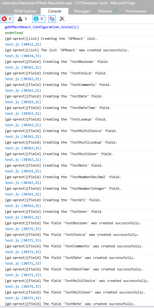
Install the List
 Now that the script file is referenced on the page, you’ll see an empty list. The next step is to open the browser console window (F-12), and typing the following command to install the test project. After the test project installs, refresh the page.
Demo.Configuration.install();
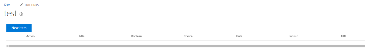
Create a New Item
Refresh the page, and click on the “New Item” button to display the new item form. 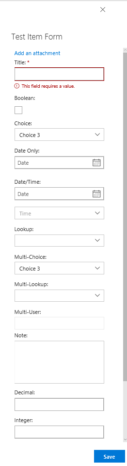
List View
After saving an item, refresh the page and you will see it in the list view. 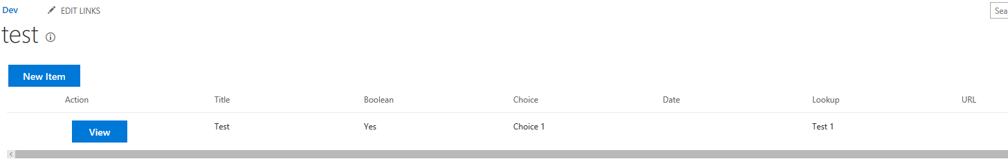
Uninstall the List
Just wanted to demo how to clean-up after yourself. Similar to the install, there is an uninstall method to remove the configuration items.
Demo.Configuration.uninstall();