Office Fabric React SharePoint Hosted Add-In
This post will go over my github project showing examples of using the Office Fabric React Framework. Refer to a previous post on the setup and configuration of the project.
Overview
Microsoft is currently using the Office Fabric React Framework to build their SharePoint Online components. As a SharePoint developer, it is my recommendation to use this framework when developing solutions for SharePoint 2013/2016/Online. The configuration of the solution separates the solution code from the SharePoint Hosted Add-In project. This allows us to upgrade it to utilize the new SharePoint Framework, as a separate project. I started a gitHub project to display examples of using the framework. I do plan to build it out, so please post “issues” in github or post a comment below, and I will add examples to this project.
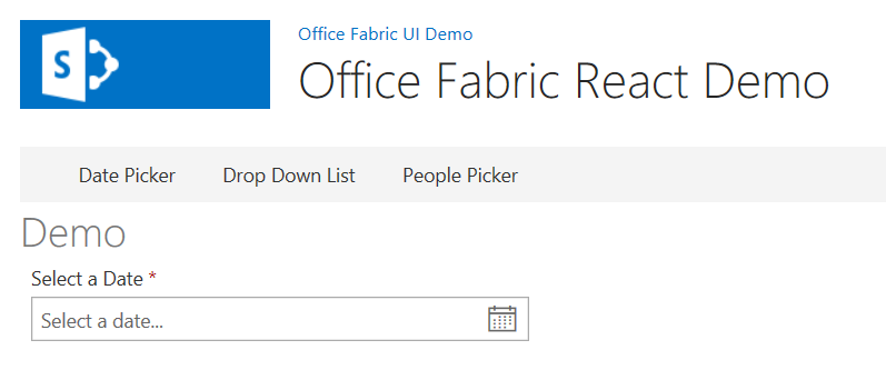
Datepicker Demo
The date picker is an important component. Unfortunately, this component doesn’t have default settings, which requires you to provide a decent amount of configuration to use it.
Configuration
The configuration of the date picker will require you to define the “strings” property. This property holds the month long/short names, day long/short names and other various messages to use. Refer to the configuration file here.
Code Sample
<DatePicker
        label="Select a Date"
        isRequired={true}
        firstDayOfWeek={DayOfWeek.Sunday}
        strings={Strings}
        placeholder='Select a date...'
/>
Demo Page
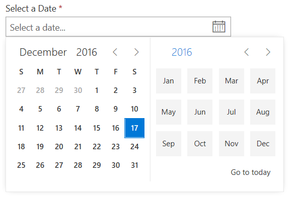
Selecting a Date
Dropdown Demo
Parent/Child dropdown lists are very common, so I thought it would be important to show an example of how to use them. Refer to the code file here.
Code Sample
<div className="ms-Grid">
        <div className="ms-Grid-row">
                <div className="ms-Grid-col ms-u-md3">
                        <Dropdown
                                label="State"
                                onChanged={option => this.onStateChange(option)}
                                options={this.state.States}
                                selectedKey={this.state.SelectedItem.State}
                        />
                </div>
        </div>
        <div className="ms-Grid-row">
                <div className="ms-Grid-col ms-u-md3">
                        <Dropdown
                                label="County"
                                onChanged={option => this.onCountyChange(option)}
                                options={this.state.Counties}
                                selectedKey={this.state.SelectedItem.County}
                        />
                </div>
        </div>
        <div className="ms-Grid-row">
                <div className="ms-Grid-col ms-u-md3">
                        <Dropdown
                                label="City"
                                options={this.state.Cities}
                                selectedKey={this.state.SelectedItem.City}
                        />
                </div>
        </div>
</div>
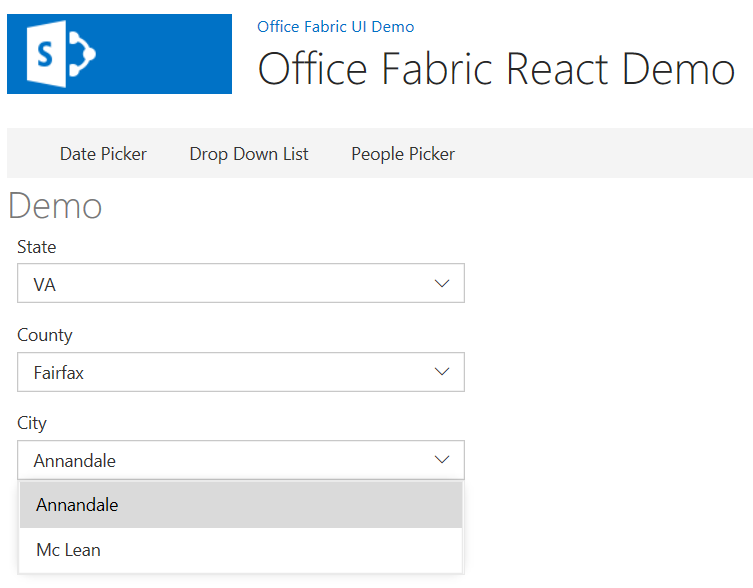
Demo Page
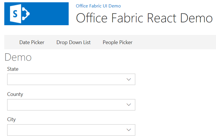
Select City
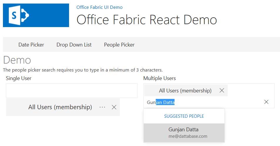
People Picker Demo
The people picker is an important component of SharePoint development, and is necessary to show an example of how to use it.
REST API
The “People Picker” api endpoint has been incorporated in my SharePoint REST Framework. I’m utilizing this framework to query REST for the people picker component. Refer to the code file here.
Code Samples
People Picker Query
// Query for the people picker
(new $REST.PeoplePicker())
        // Set the search query
        .clientPeoplePickerSearchUser({
                MaximumEntitySuggestions: 10,
                QueryString: filterText
        })
        // Execute the request
        .execute((results: $REST.Types.IPeoplePickerSearchUser) => {
                let personas = [];

                // Parse the results
                for (let result of results.ClientPeoplePickerSearchUser) {
                        // Add the persona
                        personas.push({
                                key: result.Key,
                                primaryText: result.DisplayText,
                                secondaryText: result.EntityData.Email
                        });
                }

                // Resolve the promise
                resolve(personas);

                // Update the state
                this.setState({ queryString: "", promise: null });
        });
PeoplePicker Component
<div className="ms-Grid">
        <div className="ms-Grid-row">
                <div className="ms-Grid-col ms-u-md3">
                        <Label>Single User</Label>
                        <PeoplePicker />
                </div>
                <div className="ms-Grid-col ms-u-md3">
                        <Label>Multiple Users</Label>
                        <PeoplePicker multiple={true} />
                </div>
        </div>
</div>
Demo Page