Office Fabric UI - React/Redux (Part 4 of 5)
This is the fourth of five posts going over the Office Fabric UI React library and Redux. The entire project is on github.
- Introduction and Project Creation
- Core Configuration/Files
- Office UI Fabric Navigation
- Office UI Fabric Dialog/Panel (This Post)
- Office UI Fabric Details List
Office Fabric UI - Panel Example
Adding components will be much easier now that we have the dashboard, navigation and dialog examples complete. To add the panel, we will do the following: 1. Create the Panel component 2. Update the Action Types 3. Create the Panel Actions 4. Create the Panel Actions Handler 5. Update the Navigation component
Code
- Folder: ./src/components/panel
- Filename: index.ts
import * as React from "react";
import {
    Panel,
    PanelType
} from "office-ui-fabric-react";

/**
 * Demo Panel
 */
const DemoPanel = ({closePanel, visible}) => {
    // Render the panel
    return (
        !visible ? <div /> :
        <Panel
            headerText="Demo Panel"
            isOpen={visible}
            onDismiss={closePanel}
            type={PanelType.smallFixedFar}
            />
    );
}

export default DemoPanel;
Note - The close panel and visible properties are passed in as variables.
Update the Action Types
- Folder: ./src/actions
- Filename: actionTypes.js The basic actions of a panel is showing and hiding it, so we will define them in the action types enumerator.
const ActionTypes = {
    HideDialog: "HideDialog",
    HidePanel: "HidePanel",
    ShowDialog: "ShowDialog",
    ShowPanel: "ShowPanel"
};

export default ActionTypes;
Create the Panel Actions
- Folder: ./src/actions
- Filename: panelActions.js Now that we have the action types defined, we will create the functions to show and hide the dialog. The object returned by actions MUST have the “type” property defined. This property will always be referenced by the “Action Types” we have defined.
import ActionTypes from "./actionTypes";

// Action to hide the panel
export function hide() {
    return {
        type: ActionTypes.HidePanel,
        showPanel: false
    };
}

// Action to show the panel
export function show() {
    return {
        type: ActionTypes.ShowPanel,
        showPanel: true
    };
}
Set the Default State of the Panel
- Folder: ./src/reducers
- Filename: initialState.js The panel should be hidden by default, so we will update the initial state to reflect this.
export default {
    showDialog: false,
    showPanel: false
};
Create the Panel Actions Handler
- Folder: ./src/reducers
- Filename: panelReducer.js Now that we have actions defined for the panel component, we need to handle them. We will create a reducer to handle the panel actions to show/hide it.
import ActionTypes from "../actions/actionTypes"
import initalState from "./initialState";

export default function panelReducer(state = { showPanel: initalState.showPanel }, action) {
    switch(action.type) {
            // Handle the hide/show panel actions
            case ActionTypes.HidePanel:
            case ActionTypes.ShowPanel:
                // Return a copy of the current state
                return Object.assign(
                    // Create a new blank object
                    {},
                    // Copy the default state
                    state,
                    // Update the "showPanel" state value
                    {showPanel: action.showPanel}
                );

            // Action is not handled by this reducer, return the state
            default:
                    return state;
    }
}
Update the Root Reducer
- Folder: ./src/reducers
- Filename: index.js Since we created a reducer, we will also need to update the root reducer to reference it. Update the “Root Reducer” with the following:
- Add a reference to the panel reducer.
- Add the panel reducer to the root reducer, using the combineReducers helper method from redux.
import {combineReducers} from "redux";
import dialog from "./dialogReducer";
import panel from "./panelReducer";

const rootReducer = combineReducers({
    dialog,
    panel
});

export default rootReducer;
Update the Navigation Component
To incorporate the panel in the navigation component, we will do the following: 1. Import the Panel Actions & Component 2. Update the React/Redux Connector 3. Update the Properties 4. Update the Close Dialog Method 5. Update the Menu Click Event 6. Update the Render Method
Import the Panel Actions & Component
import * as panelActions from "../../actions/panelActions";
import DemoPanel from "../panel";
Update the React/Redux Connector
- Add the showPanel property to the mapper.
- Update the actions property to be an object, and add the panel actions to it.
/**
 * Connections
 */
export default connect(
    /**
     * State to Property Mapper
     */
    (state, ownProps) => {
        return {
            showDialog: state.dialog.showDialog,
            showPanel: state.panel.showPanel
        };
    },
    /**
     * Actions Mapper
     */
    (dispatch) => {
        return {
            actions: {
                dialog: bindActionCreators(dialogActions as any, dispatch),
                panel: bindActionCreators(panelActions as any, dispatch)
            }
        };
    }
)(Navigation);
Update the Component Properties
Add the “showPanel” property to the component.
Navigation.propTypes = {
    actions: PropTypes.object.isRequired,
    showDialog: PropTypes.bool,
    showPanel: PropTypes.bool
};
Update the Close Dialog Method
Now that we have multiple components, we will do the following: 1. Update the method to better reflect the code change 2. Add a new parameter: actionType 3. Use a switch statement to execute an action based on the type
    // Method to close the dialog or panel
    close(actionType) {
        // Execute an action, based on the type
        switch(actionType) {
            // Hide the dialog
            case ActionTypes.HideDialog:
                this.props.actions.dialog.hide();
            break;
            // Hide the panel
            case ActionTypes.HidePanel:
                this.props.actions.panel.hide();
            break;
        }
    }
Note - The actions will reflect the new object we defined in the connector.
Update the Menu Click Event
Add the action type to show the panel.
    // The click event for a menu item
    onClick(event, actionType?:string) {
        // Disable postback
        event.preventDefault();

        // Execute an action, based on the type
        switch(actionType) {
            // Show the dialog
            case ActionTypes.ShowDialog:
                this.props.actions.dialog.show();
            break;
            // Show the panel
            case ActionTypes.ShowPanel:
                this.props.actions.panel.show();
            break;
        }
    }
Note - The actions will reflect the new object we defined in the connector.
Update the Render Method
- Add a new menu item for the panel.
- Add the panel component.
    // Method to render the component
    render() {
        // Get the "showDialog" state value from the properties.
        let {showDialog, showPanel} = this.props;
        return (
            <div>
                <CommandBar
                    isSearchBoxVisible={true}
                    items={[
                        {
                            key: "newRequest",
                            name: "New",
                            icon: "Add",
                            ariaLabel: 'Use left and right arrow keys to navigate',
                            onClick: event => this.onClick(event),
                            items: [
                                {
                                    key: "demo_dialog",
                                    name: "Demo Dialog",
                                    icon: "Contact",
                                    onClick: event => this.onClick(event, ActionTypes.ShowDialog)
                                },
                                {
                                    key: "demo_panel",
                                    name: "Demo Panel",
                                    icon: "People",
                                    onClick: event => this.onClick(event, ActionTypes.ShowPanel)
                                }
                            ]
                        }
                    ]}
                />
                <DemoDialog
                    visible={showDialog}
                    closeDialog={event => this.close(ActionTypes.HideDialog)}
                    />
                <DemoPanel
                    visible={showPanel}
                    closePanel={event => this.close(ActionTypes.HidePanel)}
                    />
            </div>
        );
    }
Test
Use the command prompt and navigate to the root folder of this project, and run the test script to start the webpack development server. After the server is running, goto http://localhost:8080 to view the output.
npm run test
Navigation
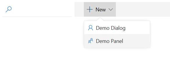
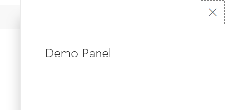
Demo Panel
Conclusion
This ends part four of the blog post. The next post will create a Details List and give an example of asynchronous actions.