SharePoint 2013 Project Deployment
This post will give a recommended approach to deploying SharePoint 2013 solutions.
Solution Architecture
Libraries
- The gd-sprest library’s automation feature is used for easy deployment.
- The gd-sprest-react library’s webpart component. Refer to a previous post discussing an approach to creating webparts utilizing modern web techniques.
Global and Web Solutions
A webpart will be created and added to the site collection’s webpart gallery in order to make it available globally. For web specific solutions, we will still generate a webpart, but create a custom interface for adding them to the page. Both solutions will utilize a custom configuration which is configured by editing the page. These approaches will ensure a SharePoint-Like experience minimizing the amount of training required.
Global Library
This solution uses webpack to bundle and package the solution and assoicated libraries into a single output file. Since we are using the Office Fabric React framework, the output file will have a decent amount of overhead. If we create each project as a component, and package them into one global library, this will minimize the duplication of libraries and size of the project files. The automation feature in the gd-sprest library allows us to create a user custom action scoped to the site-collection. A user custom action will allow us to add a script link to each page within the site collection. Using SharePoint’s Script On-Demand (SOD) library, our code can notify each other giving us the ability to control the execution order. The code shown below is an example of notifying other scripts that the “demo.js” script library has been loaded.
SP.SOD.notifyScriptLoadedAndExecuteWaitingJobs("demo.js");
Custom WebParts
The webpart we create is actually an out-of-the-box (OTB) “Script Editor” webpart. The automation feature in the gd-sprest library makes it easy to deploy it to the webpart gallery and set the “Content” property to load the our custom component from the global library. Refer to this post for additional details. This approach allows us to make updates to a single file that is applied to all webparts that are currently being used.
SP.SOD.executeOrDelayUntilScriptLoaded(function() { new Solution.Project(); }, "demo.js");
Upgrade to SPFX
One main reason why I recommend this approach, is that the code we create will migrate to the new SPFX development framework for creating modern webparts for Office 365 and SharePoint 2016. The SPFX development framework has an option for creating a modern webpart using the Office Fabric React framework, so the components we create will copy over making the upgrade process straight-foreword. The webpart we create is a “Script Editor” webpart, so it will still work in classic pages on Office 365 or SharePoint 2016.
Solution Overview
This section will go over the file and folder structure of the demo project. Refer to the prev post for a detailed overview of the webpart starter project. This project will use the same configuration and webpart component files for this demo.
Source Folder Structure
-
Common
- Common components and helper functions used across multiple projects.
-
Project
- cfg.ts - The configuration class to install/uninstall the project.
- index.ts - The project class.
- wp.tsx - The component to render when the page is being displayed.
- wpCfg.tsx - The component to render when the page is being edited.
Configuration (./src/demo/cfg.ts)
The project configuration for this project is shown below. It consists of the following:
- Custom Action - A custom ribbon button to add solutions targeted to a specific web.
- WebPart - The webpart deployed to the site collection gallery.
import { ContextInfo, Helper } from "gd-sprest";
declare var SP;
/**
* Data Source
*/
export const Configuration = new Helper.SPConfig({
// Custom Action
CustomActionCfg: {
Site: [
{
Description: "Adds a reference to the demo solution library.",
Group: "Demo",
Location: "ScriptLink",
Name: "Demo_Library",
Title: "Demo Library",
ScriptSrc: "~sitecollection/siteassets/dev/demo.js"
}
],
Web: [
{
Description: "Custom ribbon dropdown for wiki and webpart pages in edit mode.",
Group: "Demo",
Location: "CommandUI.Ribbon",
Name: "Demo_WebRibbon",
Title: "Demo - Web Ribbon",
CommandUIExtension:
`
<CommandUIExtension>
<CommandUIDefinitions>
<CommandUIDefinition Location="Ribbon.WebPartPage.Edit.Controls._children">
<Button
Id="DemoAddWebPart"
Command="DemoAddWebPart"
Image32by32="/_layouts/15/1033/images/formatmap32x32.png?rev=44"
Image32by32Left="-443"
Image32by32Top="-375"
LabelText="Add Demo"
Description="Add the demo webpart"
TemplateAlias="o1"
/>
</CommandUIDefinition>
</CommandUIDefinitions>
<CommandUIHandlers>
<CommandUIHandler
Command="DemoAddWebPart"
CommandAction="javascript:Solution.Demo.Configuration.addDemoWebPart();"
/>
</CommandUIHandlers>
</CommandUIExtension>
`
}
]
},
// WebPart Configuration
WebPartCfg: [
{
FileName: "dev_wpDemo.webpart",
Group: "Demo",
XML: `<?xml version="1.0" encoding="utf-8"?>
<webParts>
<webPart xmlns="http://schemas.microsoft.com/WebPart/v3">
<metaData>
<type name="Microsoft.SharePoint.WebPartPages.ScriptEditorWebPart, Microsoft.SharePoint, Version=15.0.0.0, Culture=neutral, PublicKeyToken=71e9bce111e9429c" />
<importErrorMessage>$Resources:core,ImportantErrorMessage;</importErrorMessage>
</metaData>
<data>
<properties>
<property name="Title" type="string">Demo Webpart</property>
<property name="Description" type="string">Demo webpart from a generated webpart file.</property>
<property name="ChromeType" type="chrometype">None</property>
<property name="Content" type="string">
<div id="wp-demo"></div>
<div id="wp-demoCfg" style="display: none;"></div>
<script type="text/javascript">SP.SOD.executeOrDelayUntilScriptLoaded(function() { new Solution.Demo.WebPart(); }, "demo.js");</script>
</property>
</properties>
</data>
</webPart>
</webParts>`
}
]
});
Web Level Solutions
The configuration file has a method with the logic to add the demo webpart. This method is called from the custom ribbon button’s “CommandUIHander” element.
// Method to add a webpart to the current page
Configuration["addDemoWebPart"] = () => {
// Get the current context
let context = SP.ClientContext.get_current();
// Get the webpart from the current page
let page = context.get_web().getFileByServerRelativeUrl(ContextInfo.serverRequestPath);
let wpMgr = page.getLimitedWebPartManager(SP.WebParts.PersonalizationScope.shared);
// Import the webpart
let wpDef = wpMgr.importWebPart(`<?xml version="1.0" encoding="utf-8"?>
<webParts>
<webPart xmlns="http://schemas.microsoft.com/WebPart/v3">
<metaData>
<type name="Microsoft.SharePoint.WebPartPages.ScriptEditorWebPart, Microsoft.SharePoint, Version=15.0.0.0, Culture=neutral, PublicKeyToken=71e9bce111e9429c" />
<importErrorMessage>$Resources:core,ImportantErrorMessage;</importErrorMessage>
</metaData>
<data>
<properties>
<property name="Title" type="string">Demo Webpart</property>
<property name="Description" type="string">Demo webpart added by a custom ribbon button.</property>
<property name="ChromeType" type="chrometype">TitleOnly</property>
<property name="Content" type="string">
<div id="wp-demo"></div>
<div id="wp-demoCfg" style="display: none;"></div>
<script type="text/javascript">SP.SOD.executeOrDelayUntilScriptLoaded(function() { new Solution.Demo.WebPart(); }, "demo.js");</script>
</property>
</properties>
</data>
</webPart>
</webParts>`);
// Get the first webpart zone on the page
let wpZone: any = document.querySelector("#MSOZone");
wpZone = wpZone ? wpZone.getAttribute("zoneid") : null;
if (wpZone) {
// Get the webpart and add it to the page
var wp = wpDef.get_webPart();
wpMgr.addWebPart(wp, wpZone, 0);
context.load(wp);
// Execute the request
context.executeQueryAsync(
// Success
() => {
// Disable the edit page warning
if (SP && SP.Ribbon && SP.Ribbon.PageState && SP.Ribbon.PageState.PageStateHandler) {
SP.Ribbon.PageState.PageStateHandler.ignoreNextUnload = true;
}
// Refresh the page
window.location.href = window.location.href;
},
// Error
(...args) => {
// Log
console.error("Error adding the webpart.")
console.error(args[1].get_message());
}
);
} else {
// Log
console.error("Unable to detect a webpart zone on the page.");
}
}
WebPart Files
This demo will not focus on the webpart, you can refer to this post for additional details. Display Component (./src/demo/wp.tsx)
import * as React from "react";

/**
 * Demo WebPart
 */
export class DemoWebPart extends React.Component<null, null> {
    // Render the component
    render() {
        return (
            <p>Hello World</p>
        );
    }
}
Project Class (./src/demo/index.tsx)
import * as React from "react";
import { WebPartConfigurationPanel } from "gd-sprest-react";

/**
 * WebPart Configuration
 */
export class WebPartCfg extends WebPartConfigurationPanel {
    // Method to render the webpart configuration panel
    onRenderContents = (cfg) => {
        return (
            <p>This is where your custom edit interface goes.</p>
        );
    }
}
Global Variable (./src/index.ts)
The entry point of the solution will
import * as React from "react";
import { WebPart } from "gd-sprest-react";
import { Configuration } from "./cfg";
import { DemoWebPart } from "./wp";
import { WebPartCfg } from "./wpCfg";

/**
 * Demo
 */
export class Demo {
    // Configuration
    static Configuration = Configuration;

    // Demo WebPart
    static WebPart = () => {
        // Create an instance of the webpart
        new WebPart({
            cfgElementId: "wp-demoCfg",
            displayElement: DemoWebPart,
            editElement: WebPartCfg,
            targetElementId: "wp-demo"
        });
    }
}
Deployment
Build the Solution
npm run build
Deploy to Web
Copy the “demo.js” file to the library of a SharePoint web.
Install the Solution
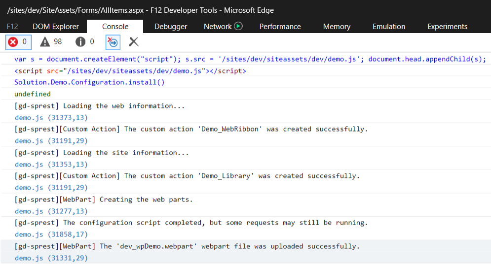
Press F-12 to access the developer browser console. 1. Reference the Script
var s = document.createElement("script"); s.src = '/sites/dev/siteassets/dev/demo.js'; document.head.appendChild(s);
Note - The demo.js file is stored in the /sites/dev web, in the ‘Site Assets’ library’s ‘dev’ folder. 2. Install the Solution
Solution.Demo.Configuration.install()
Demo
Site Solution
1. Create a Page Create a demo page. If you are using an Office 365 environment, make sure to create a classic page. 2. Edit Page Edit the demo page, and click on any webpart zone’s “Add WebPart” link. 3. Add Demo WebPart Select the demo webpart from the “Demo” category. 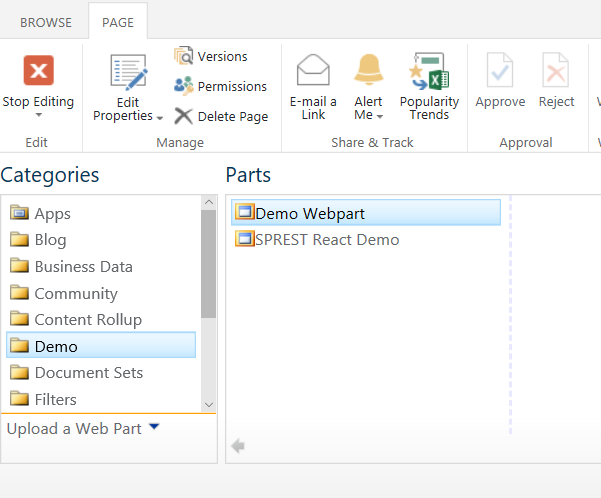 4. WebPart (Edit Mode)
 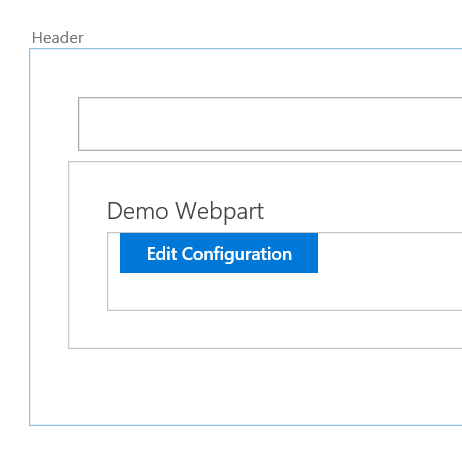 5. Configure the WebPart
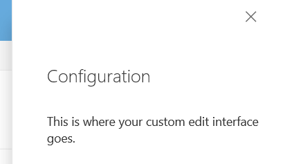
Web Solution
1. Create a Page Create a demo page. If you are using an Office 365 environment, make sure to create a classic page. 2. Edit Page Edit the demo page, and click on any webpart zone’s “Add WebPart” link. 3. Add Demo WebPart Select the demo webpart from the “Demo” category. 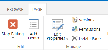 4. WebPart (Display Mode)