SharePoint 2013/Online React WebParts
This post will go over new webpart classes available in the gd-sprest-react library. I created a new GitHub project for code examples. I plan to grow this with various examples, so it’s easy to reference.
Available WebPart Classes
Refer to this blog post for a detailed explanation of the webpart component. Below are a list of the current available webpart classes.
WebPart
This is the base webpart class, which will render the display or edit component depending on the page’s context. This is a useful class to control what to render, based on the page’s current context. We will use this class in the entry point of the solution.
WebPart Configuration
This is the base webpart configuration panel. There is a OnRenderContents event that is used to render the configuration panel’s contents.
WebPart List
This is the base list webpart class, for the list configuration webpart. There are OnRenderContainer and OnRenderItem events, which are used to render the items.
WebPart List Configuration
This class inherits from the base webpart configuration class, and adds a list dropdown. An optional textbox is displayed, to specify the web containing the list. There are onRenderHeader and onRenderFooter events that can be used to render custom components.
WebPart Search
This is the base search webpart class, inheriting from the list webpart. This webpart includes a tag picker, which will filter the items based on the searchable fields.
WebPart Search Configuration
This class inherits from the list webpart configuration class, and adds a field picker for the list dropdown. This field picker is limited to specific field types (Choice, Lookup, Taxonomy and Text). These field values will be used to generate a picker tag list, which the user can use to filter the document view.
Doc View WebPart Example
This example webpart will utilize the search configuration webpart and extend the search webpart classes. This example will also give an example of using the WopiFrame page, so you can display documents using the OTB sharepoint pages and javascript classes.
Entry Point (./src/index.ts)
This is the entry point for the github project. This file will import all of the examples, and make them available under a global library called “DemoWebParts”. We are utilizing the SharePoint SOD (Script on Demand) library to notify other scripts that our demo script has been loaded.
import {DocView} from "./docView";
declare var SP;

// Create the Demo WebParts global variable
window["DemoWebParts"] = {
    DocView
};

// Let SharePoint know this file has loaded
SP.SOD.notifyScriptLoadedAndExecuteWaitingJobs("webparts.js")
Doc View WebPart (./src/docView/index.ts)
This is the main entry point for the document view webpart example. The configuration is used to add/remove our custom webpart to/from the gallery. We are making it a constant, so it’s available outside of initiating an instance of this class. The constructor will create a new instance of the WebPart base class, allowing us to define the display/edit element ids, and the components to render. This demo will use the search webpart configuration component, so we don’t actually need to code anything for the configuration panel.
import { WebPart, WebPartSearchCfg } from "gd-sprest-react";
import { Configuration } from "./cfg";
import { DocViewWebPart } from "./wp";
import "./docView.scss";

/**
 * Document View
 */
export class DocView {
    // Configuration
    static Configuration = Configuration;

    /**
     * Constructor
     */
    constructor() {
        // Create an instance of the webpart
        new WebPart({
            cfgElementId: "wp-docViewCfg",
            displayElement: DocViewWebPart,
            editElement: WebPartSearchCfg,
            targetElementId: "wp-docView",
        });
    }
}
Configuration
The configuration class will utilize the automation feature in the gd-sprest library. We are generating the webpart file to be a ScriptEditor webpart with the properties and content pre-defined. Notice that I’ve included a link to the script file in the content. This is just for demo purposes. The content element contains the display and edit element ids we defined in the webpart instance.
import { Helper } from "gd-sprest";
/**
* Configuration
*/
export const Configuration = new Helper.SPConfig({
WebPartCfg: [
{
FileName: "wp_docView.webpart",
Group: "Dattabase",
XML: `<?xml version="1.0" encoding="utf-8"?>
<webParts>
<webPart xmlns="http://schemas.microsoft.com/WebPart/v3">
<metaData>
<type name="Microsoft.SharePoint.WebPartPages.ScriptEditorWebPart, Microsoft.SharePoint, Version=15.0.0.0, Culture=neutral, PublicKeyToken=71e9bce111e9429c" />
<importErrorMessage>$Resources:core,ImportantErrorMessage;</importErrorMessage>
</metaData>
<data>
<properties>
<property name="Title" type="string">Document View</property>
<property name="Description" type="string">Displays documents as icons.</property>
<property name="ChromeType" type="chrometype">None</property>
<property name="Content" type="string">
<script type="text/javascript" src="/sites/dev/siteassets/webparts.js"></script>
<div id="wp-docView"></div>
<div id="wp-docViewCfg" style="display:none"></div>
<script type="text/javascript">SP.SOD.executeOrDelayUntilScriptLoaded(function() { new DemoWebParts.DocView(); }, 'webparts.js');</script>
</property>
</properties>
</data>
</webPart>
</webParts>`
}
]
});
Document View
The document view component inherits from the WebPartSearch class. We will create an interface for the “Document Item”, which will inherit from the IWebPartSearchItem interface. This will ensure intellisense is made available for the list item. The constructor of this class will update the “query” object, which is used to query the list items. We are adding the document list item fields, which matches the IDocument interface. Since we are inheriting the WebPartSearch class, we only need to define the OnRenderItem event. The OnRenderContainer event is option, if you want to specify the elements the items are rendered to. The example below will render the items using the Office Fabric UI Grid class. Based on the document type, we will render an icon from the Office Fabric UI framework. Clicking on the icon will display or download the document, based on the type.
import * as React from "react";
import { ContextInfo } from "gd-sprest";
import { WebPartSearch, IWebPartSearchItem } from "gd-sprest-react";
declare var SP;

/**
 * Document Item
 */
interface IDocument extends IWebPartSearchItem {
    DocIcon: string;
    FileRef: string;
    LinkFilename: string;
}

/**
 * Document View
 */
export class DocViewWebPart extends WebPartSearch {
    /**
     * Constructor
     */
    constructor(props) {
        super(props);

        // Update the query to include the document fields
        this._query.Select = ["DocIcon", "FileRef", "ID", "LinkFilename"];
    }

    /**
     * Events
     */

    // The doc icon click event
    onDocIconClicked = (ev: React.MouseEvent<HTMLDivElement>) => {
        // Prevent postback
        ev.preventDefault();

        // Get the document url
        let docUrl = ev.currentTarget.getAttribute("data-docUrl");

        // See if this is an office document
        if (ev.currentTarget.getAttribute("data-isOfficeDoc") == "true") {
            // Display the document in a modal dialog
            SP.SOD.execute("sp.ui.dialog.js", "SP.UI.ModalDialog.showModalDialog", {
                showMaximized: true,
                title: "",
                url: docUrl
            });
        } else {
            // Open the document in a new window/tab
            window.open(docUrl, "_blank");
        }
    }

    // The render container event
    onRenderContainer = (items: Array<IDocument>) => {
        let elements = [];

        // Parse the items
        for (let i = 0; i < items.length; i++) {
            // Add the item
            elements.push(this.onRenderItem(items[i]));
        }

        // Render the container
        return (
            <div className="ms-Grid">
                <div className="ms-Grid-row">{elements}</div>
            </div>
        );
    }

    // The render item event
    onRenderItem = (item: IDocument) => {
        let isOfficeDocFl = false;

        // Compute the document image url
        let docUrl = ContextInfo.webAbsoluteUrl + "/_layouts/15/WopiFrame2.aspx?sourcedoc=" + item.FileRef + "&action=present";

        // Determine the icon
        let icon = "";
        switch (item.DocIcon) {
            case "docx":
                icon = "WordLogo";
                isOfficeDocFl = true;
                break;
            case "pdf":
                icon = "PDF";
                break;
            case "pptx":
                icon = "PowerPointLogo";
                isOfficeDocFl = true;
                break;
            case "vsdx":
                icon = "VisioLogo";
                isOfficeDocFl = true;
                break;
            case "xlsx":
                icon = "ExcelLogo";
                isOfficeDocFl = true;
                break;
            default:
                icon = "Document";
                break;
        }

        // Render the item
        return (
            <div
                className="ms-Grid-col ms-md1 ms-textAlignCenter docView-item"
                data-docUrl={isOfficeDocFl ? docUrl : item.FileRef}
                data-isOfficeDoc={isOfficeDocFl}
                key={"item_" + item.Id}
                onClick={this.onDocIconClicked}>
                <i className={"ms-fontSize-su ms-Icon ms-Icon--" + icon} />
                <span className="ms-fontSize-mPlus">{item.LinkFilename}</span>
            </div>
        );
    }
}
Demo
Now that we have the code in place, we can build it and upload it to SharePoint. I will test Online, but this example will work in SharePoint 2013.
1. Build and Copy Assets
- Build the solution
- Copy the “webparts.js” file in the dist folder to your SharePoint site
- Access a webpart or wiki page. If you are using SharePoint Online, then you must create a classic page.
2. Install WebPart
- Press F-12 to access the developer window
- Select the “Console” tab
- Load the script
var s = document.createElement("script"); s.src = "[relative url to your script]"; document.head.appendChild(s);
- Add the webpart to the gallery
DemoWebParts.DocView.Configuration.install();
3. Demo Data
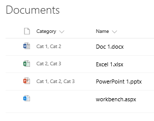
Before we go further, let’s go over the demo data. I added a choice field to the “Documents” list. The library has the following files:
- Doc 1.docx - Cat 1, Cat 2
- Excel 1.xlsx - Cat 2, Cat 3
- PowerPoint 1.pptx - Cat 1, Cat 2, Cat 3
- workbench.aspx - No categories selected
4. Demo WebPart
- Edit the page
- Add a webpart to the desired zone
- From the webpart gallery, find the webpart. Recommended to set the ‘Group’ property of the webpart in the configuration.
- Click on the “Edit Configuration” button
- Select the ‘Documents’ library from the drop down list.
- In the “Searchable Fields” textbox, type in “Category” and select it from the tag picker.
- Click on Save
- Save the page and exit out of the edit mode
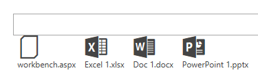
- After the page loads, you will see the documents and a tag picker
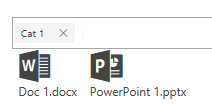
- Type in “Cat 1” and only the word and powerpoint files should be displayed
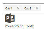
- Type in “Cat 3” and only the powerpoint file should be displayed
- Clear the picker list and all files should return
- Click on any office document and view the document in the office app
4. Uninstall WebPart
- Press F-12 to access the developer window
- Select the “Console” tab
- Remove the webpart from the gallery
DemoWebParts.DocView.Configuration.uninstall();