Office Fabric React/Redux SharePoint Starter Project
This post will give an overview of the Office Fabric UI React/Redux SharePoint starter project. Please refer to previous blog posts for additional information on React and Redux. The code for this post can be found on github. This project template can be used in SharePoint 2013+ environments.
File/Folder Structure
Refer to a previous blog post for additional information.
- dist - The compiler output.
- node_modules - Associated project libraries.
- src - The source code
- src/actions - The available actions for the project.
- src/components - The project components.
- src/data - The datasource classes.
- src/reducers - The action handlers.
- src/store - The redux store.
- src/index.tsx - The entry point of the project.
- index.html - The html page used to test the project.
- package.json - The npm configuration file.
- tsconfig.json - The TypeScript configuration file.
- webpack.config.js - The WebPack configuration file.
Actions Folder
- actionTypes.ts - An enumerator containing the available actions for the project.
- pageActions.ts - The page actions.
Components Folder
- dashboard.tsx - The dashboard component.
- index.ts - Reference for all available project components.
- navigation.tsx - The navigation component.
Data Folder
- templateData - The page data source.
Reducers Folder
- index.ts - Reference for all available action handlers.
- initialState.ts - The default values for the project.
- pageReducer.ts - The handlers for the page actions.
Store Folder
- configureStore.ts - The redux store configuration.
Project Overview
The starter project gives sample code for displaying the Fabric Pivot and Spinner components. I will go through and explain what’s going on from the entry point of the project to the rendering of the pivot component.
Entry Point (index.tsx)
The entry point of the project will create the redux store, load the data and render the main component. The “Helper.Loader.waitForSPLibs()” is optional. This method is one of many helper methods available in the gd-sprest library. It will wait until the SharePoint core libraries are loaded before executing the callback method, with a timeout of 2.5 seconds. There are other optional parameters to set the timeout or manually load the core libraries.The timeout of 2.5 seconds can provide a delay to simulate loading of data for the test page. In general, the SharePoint core libraries are already available by the time this code is running, so this method is really for the test page. This method may come in handy if you are using a minimal html page in SharePoint, similar to this one. After the SP core libraries are loaded, we will call the “loadData” action method and pass the dispatch to the redux store. This will load the sample page data asynchronously.
// Create the store
const store = configureStore();

// Wait for the page to load
Helper.Loader.waitForSPLibs(() => {
    // Load the data
    store.dispatch(pageActions.loadData());
});

// Render the app
render(
    <Provider store={store}>
        <Dashboard />
    </Provider>,
    document.getElementById("app")
);
Page Actions
The page actions contains a sample method to load the data. The action will return a dispatch, since we are executing this asynchronously. After the data is loaded, the dispatch will pass the action type “LoadData” and navigation data to the action handlers.
// Method to load the data for the page.
export function loadData() {
    // Return a dispatch
    return function(dispatch) {
        // Load the data and return the promise
        return PageData.load().then((data:Array<IPageData>) => {
            // Resolve the promise
            dispatch({
                type: ActionTypes.LoadData,
                data
            });
        });
    };
}
Page Data (data/pageData.ts)
The page data provides a template for querying a SharePoint list using the gd-sprest library. The “ContextInfo” will check to see if the SharePoint core libraries are loaded. This is really used for the test page, since we are not testing in a SharePoint environment. If a SharePoint environment is detected, it will query the SharePoint list and return the item collection, otherwise it will return test data.
/**
 * Interface
 */
export interface IPageData {
    Title: string
}

/**
 * Page Data
 */
export class PageData {
    // Method to load the data
    static load() {
        // Return a promise
        return new Promise((resolve, reject) => {
            // See if the SP environment exists
            if(ContextInfo.existsFl) {
                // Get the list
                (new List("PageData"))
                    // Get the items
                    .Items()
                    // Query the items
                    .query({
                        OrderBy: ["Title"],
                        Select: ["ID", "Title"]
                    })
                    // Execute the request
                    .execute((items:Types.IListItems) => {
                        let data:Array<IPageData> = [];

                        // Ensure the items exists
                        if(items.existsFl) {
                            // Parse the items
                            for(let item of items.results) {
                                // Add the item
                                data.push({
                                    Title: item["Title"]
                                });
                            }
                        }

                        // Resolve the promise
                        resolve(data);
                    });
            }
            // Else, resolve the promise with the test data
            else {
                resolve(TestData);
            }
        });
    }
}

/**
 * Test Data
 */
const TestData: Array<IPageData> = [
    {
        Title: "Tab 1"
    },
    {
        Title: "Tab 2"
    },
    {
        Title: "Tab 3"
    },
    {
        Title: "Tab 4"
    },
    {
        Title: "Tab 5"
    }
]
Page Action Handlers (reducers/pageReducer.ts)
The “loadData” action method will be passed the action type and navigation data. The action handler is simply a switch statement using the available action types. Based on the action type executed, we will copy the state and update it w/ the navigation data.
export default function pageReducers(state = initalState, action) {
    // Check the requested action
    switch(action.type) {
        // See if this action is handled by this reducer
        case ActionTypes.LoadData:
            // Return a copy of the state
            return ObjectAssign(
                {},
                state,
                // The updated state
                { data: action.data }
            );

        // Return the state if this reducer doesn't handle the requested action
        default:
            return state;
    }
}
Dashboard (src/dashboard.tsx)
The dashboard will give an example of connecting the component to the page action handler. The properties interface will provide intellisense and compiler errors if the wrong property is referenced incorrectly. The page action handler will pass the navigation data to this component’s “data” property. We will pass this data to the “Navigation” component. In general your main component will have a connection, which passes the state data to the various components. This way the components used in the “Dashboard” will contain simple and less complex code.
/**
 * Properties
 */
interface Props {
    actions: any,
    data: Array<any>
}

/**
 * Dashboard
 */
class Dashboard extends React.Component<any, any> {
    // Render the Component
    render() {
        let {data} = this.props;
        return (
            <div>
                <Navigation data={data} />
            </div>
        );
    }
}

/**
 * Connections
 */
export default connect(
    /**
     * State to Property Mapper
     */
    (state, ownProps) => {
        return {
            data: state.page.data
        }
    }
)(Dashboard);
Navigation (navigation.tsx)
The navigation will render the tab names, based on the data passed to it. The “renderPivotItems” method will generate the sample tabs and content. If no data is provided, a spinner will be displayed telling the user that the data is currently being loaded. For the test page, this will take 2.5 seconds, since we are using the “waitForSPLibs” method to wait for the SharePoint core libraries to be loaded. The render method will render the spinner or tabs to the page.
/**
 * Properties
 */
interface Props {
    data: Array<IPageData>
}

/**
 * Navigation
 */
export class Navigation extends React.Component<Props, any> {
    // Method to render the component
    render() {
        let {data} = this.props;

        // Ensure data exists
        if(data == null) {
            // Return a loading panel
            return <Spinner label="Loading..." />
        }

        // Render the component
        return (
            <Pivot>
                {this.renderPivotItems()}
            </Pivot>
        );
    }

    // Method to render the pivot items
    renderPivotItems() {
        let counter = 0;
        let {data} = this.props;
        let items = [];

        // Parse the data
        for(let tabName of data) {
            // Add the pivot item
            items.push(
                <PivotItem linkText={tabName.Title} key={"tab_" + counter++}>
                    This is the content for the '{tabName.Title}' tab.
                </PivotItem>
            );
        }

        // Return the items
        return items;
    }
}
Sample Output
To run this project, type in “npm run test” to start the webpack dev server. Making changes to the code will trigger the react-hot-loader plugin to recompile. Refreshing the page after it recompiles will display the code changes for faster development. 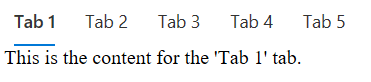 Click here to view the sample output.