Office Fabric UI - React/Redux (Part 3 of 5)
This is the third of five posts going over the Office Fabric UI React library and Redux. The entire project is on github.
- Introduction and Project Creation
- Core Configuration/Files
- Office UI Fabric Navigation (This Post)
- Office UI Fabric Dialog/Panel
- Office UI Fabric Details List
Office Fabric UI - Navigation Example
Now that we have the project setup and the core files in place, we can now start adding our components. We will create the following components, in order of complexity: 1. Dashboard 2. Dialog 3. Navigation
Dashboard
- Folder: ./src/components/dashboard
- Filename: index.ts The dashboard component will act as the main entry point of the application, and is a state-less component.
State-Less Component Example
A state-less component is a component which essentially outputs static html and doesn’t interact state changes or the store. It’s best to start off with a simple example, before moving into state components.
Code
Imported Libraries
- [react] React - The react library.
- Navigation - The navigation component we will create last.
import * as React from "react";
import Navigation from "../navigation";

/**
 * Dashboard
 */
const Dashboard = () => {
    // Render the component
    return (
        <div>
            <Navigation />
        </div>
    );
}

export default Dashboard;
Update index.tsx Entry
- Folder: ./src
- Filename: index.tsx Now that we have the main component defined for the application, we can add it to the provider. Make the following changes to the index.js file:
- Import the dashboard component.
- Add the dashboard component to the “Provider” component.
Code
import * as React from "react";
import {render} from "react-dom";
import {Provider} from "react-redux";
import configureStore from "./store/configureStore";
import Dashboard from "./components/dashboard";

const store = configureStore();

render(
    <Provider store={store}>
            <Dashboard />
    </Provider>,
    document.getElementById("app")
);
Dialog
- Folder: ./src/components/dialog
- Filename: index.tsx The dialog component will be controlled by the Navigation component. The redux store will contain the current “showDialog” boolean state value, which will be referenced in this component. Once we create the component, we will need to do the following:
- Update the Action Types Enumerator
- Create the Dialog Actions
- Set the Default State of the Dialog
- Create the Handler for the Dialog Actions
- Update the Root Reducer
Code
Imported Libraries
- [react] React - The react library.
- [office fabric ui] Dialog, DialogType - The office fabric ui dialog components.
import * as React from "react";
import {
Dialog,
DialogType
} from "office-ui-fabric-react";
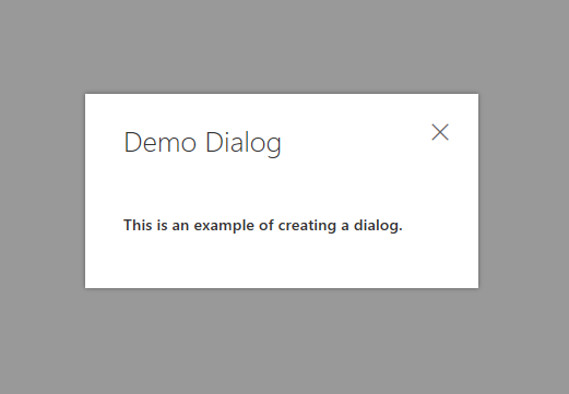
/**
* Demo Dialog
*/
const DemoDialog = ({closeDialog, visible}) => {
return (
<Dialog
isBlocking={true}
isOpen={visible}
onDismiss={closeDialog}
type={DialogType.close}
title="Demo Dialog">
<h5>This is an example of creating a dialog.</h5>
</Dialog>
);
}
export default DemoDialog;
Note - The close dialog and visible properties are passed in as variables.
Update the Action Types Enumerator
- Folder: ./src/actions
- Filename: actionTypes.ts The basic actions of a dialog is showing and hiding it, so we will define them in the action types enumerator.
const ActionTypes = {
    HideDialog: "HideDialog",
    ShowDialog: "ShowDialog"
}
export default ActionTypes;
Create the Dialog Actions
- Folder: ./src/actions
- Filename: dialogActions.ts Now that we have the action types defined, we will create the functions to show and hide the dialog. The object returned by actions MUST have the “type” property defined. This property will always be referenced by the “Action Types” we have defined.
import ActionTypes from "./actionTypes";

// Action to hide the dialog
export function hide() {
    return {
        type: ActionTypes.HideDialog,
        showDialog: false
    };
}

// Action to show the dialog
export function show() {
    return {
        type: ActionTypes.ShowDialog,
        showDialog: true
    };
}
Set the Default State of the Dialog
- Folder: ./src/reducers
- Filename: initialState.ts The dialog should be hidden by default, so we will update the initial state to reflect this.
export default {
    showDialog: false
};
Create the Handler for the Dialog Actions
- Folder: ./src/reducers
- Filename: dialogReducer.ts Now that we have actions defined for the dialog component, we need to handle them. We will create a reducer to handle the dialog actions to show/hide it.
import ActionTypes from "../actions/actionTypes"
import initalState from "./initialState";

export default function dialogReducer(state = { showDialog: initalState.showDialog }, action) {
    switch(action.type) {
            // Handle the hide/show dialog actions
            case ActionTypes.HideDialog:
            case ActionTypes.ShowDialog:
                // Return a copy of the current state
                return Object.assign(
                    // Create a new blank object
                    {},
                    // Copy the default state
                    state,
                    // Update the "showDialog" state value
                    {showDialog: action.showDialog}
                );

            // Action is not handled by this reducer, return the state
            default:
                    return state;
    }
}
Note - The state is defaulted to the “initialState.showDialog” value.
Update the Root Reducer
- Folder: ./src/reducers
- Filename: index.ts Since we created a reducer, we will also need to update the root reducer to reference it. Update the “Root Reducer” with the following:
- Add a reference to the dialog reducer.
- Add the dialog reducer to the root reducer, using the combineReducers helper method from redux.
import {combineReducers} from "redux";
import dialog from "./dialogReducer";

const rootReducer = combineReducers({
    dialog
});

export default rootReducer;
Navigation
State Component Example
A state component is a component which interacts with the redux store. This will require a little bit more code to setup, but there are helper methods to map our actions and states to the component.
Code
- Folder: ./src/components/navigation
- Filename: index.ts There is a lot going on in this file, so I’ll break it out to separate sections.
Imported Libraries
- [react] React - The react library.
- [react] PropTypes - The property type enumerator.
- [redux] bindActionCreators - Helper method to bind the actions to the component.
- [react-redux] connect - Helper method to connect the redux store to react.
- dialogActions - The available dialog actions.
- ActionTypes - The action types enumerator.
- DemoDialog - The demo dialog component.
- CommandBar - The office fabric commandbar component.
import * as React from "react";
import {bindActionCreators} from 'redux';
import {connect} from "react-redux";
import * as dialogActions from "../../actions/dialogActions";
import ActionTypes from "../../actions/actionTypes";
import DemoDialog from "../dialog";
import {
    CommandBar
} from "office-ui-fabric-react";
Component Properties
The expected properties of this component. We will use this to define the Navigation class component.
/**
 * Properties
 */
interface Props {
    actions: any,
    showDialog: boolean
}
Constructor
We are using the constructor to bind the events to the component. This is important when using the “this” object, to ensure it’s referencing the class component.
/**
 * Navigation
 */
class Navigation extends React.Component<Props, any> {
    // Constructor
    constructor(props, context) {
        super(props, context);

        // Bind the event
        this.closeDialog = this.closeDialog.bind(this);
        this.onClick = this.onClick.bind(this);
    }
Close Dialog Method
The closeDialog event will call the action to hide the dialog.
    // Method to close the dialog
    closeDialog(event) {
        // Disable postback
        event.preventDefault();

        // Hide the dialog
        this.props.actions.hide();
    }
Menu Item Click Event
The click event will call the action to show the dialog.
    // The click event for a menu item
    onClick(event, actionType?:string) {
        // Disable postback
        event.preventDefault();

        // Execute an action, based on the type
        switch(actionType) {
            // Show the dialog
            case ActionTypes.ShowDialog:
                this.props.actions.show();
            break;
        }
    }
Render Method
// Method to render the component
render() {
// Get the "showDialog" state value from the properties.
let {showDialog} = this.props;
return (
<div>
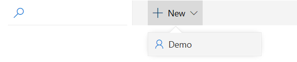
<CommandBar
isSearchBoxVisible={true}
items={[
{
key: "newRequest",
name: "New",
icon: "Add",
ariaLabel: 'Use left and right arrow keys to navigate',
onClick: event => this.onClick(event),
items: [
{
key: "demo",
name: "Demo",
icon: "Contact",
onClick: event => this.onClick(event, ActionTypes.ShowDialog)
}
]
}
]}
/>
<DemoDialog
visible={showDialog}
closeDialog={this.closeDialog}
/>
</div>
);
}
}
Note - The show dialog property and close dialog method are passed to the “Demo Dialog” component through its properties.
React-Redux Connector
The react-redux library has a helper method to help with the following: 1. Mapping the state to properties. 2. Mapping the available actions for this component. Note - The state-to-property mapper uses the “reducer name”, in our case “dialog”, as the object containing the state value. Note - The actions mapper will map the defined actions, in our case the functions defined in the ./src/actions/dialogActions.js file, to “this.props.actions”.
/**
 * Connections
 */
export default connect(
    /**
     * State to Property Mapper
     */
    (state, ownProps) => {
        return {
            showDialog: state.dialog.showDialog,
        };
    },
    /**
     * Actions Mapper
     */
    (dispatch) => {
        return {
            actions: bindActionCreators(dialogActions as any, dispatch)
        };
    }
)(Navigation);
Test
We are finally able to test the work. Use the command prompt and navigate to the root folder of this project, and run the test script to start the webpack development server. After the server is running, goto http://localhost:8080 to view the output.
npm run test
Navigation
Demo Dialog
Conclusion
This ends part three of the blog post. The next post will go create the panel component of the application.