SharePoint Scripts Starter Project
This post will go over the SharePoint Scripts starter project. Please refer to previous blog posts for additional information on React and JSLinks. The code for this post can be found on github. This project template is for SharePoint 2013+ environments.
File/Folder Structure
- dist - The compiler output.
- node_modules - Associated project libraries.
- src - The source code
- package.json - The npm configuration file.
- tsconfig.json - The TypeScript configuration file.
- webpack.config.js - The WebPack configuration file.
Libraries
- gd-sprest - An easy way to develop against the SharePoint REST api.
- office-ui-fabric-react - The Office Fabric-UI React framework.
- react, react-dom - Required for React.
- @types/react, @types/react-dom - Required for intellisense in VS Code.
- babel-core - Required for babel compiler.
- babel-preset-es2015 - Compiles the code to es2015.
- sass-loader, node-sass, css-loader, style-loader - Required for using SASS.
- es6-promise - Required to use a promise in es2015.
- ts-loader - Required to compile the TypeScript code.
- webpack - Required for WebPack.
WebPack Configuration
It’s important to review the webpack configuration file, since we are creating multiple output files. The entry is an object where the key is the output file name and the value is the path to the file relative to the source folder. The output can then be defined to use ‘[name]’ as the “key” of the entry object. The output files will be testProject.js and testProject_jslink.js.
    // Target the output of the typescript compiler
    context: path.join(__dirname, "src"),

    // File(s) to target
    entry: {
        testProject: "./index.tsx",
        testProject_jslink: "./jslink.tsx"
    },

    // Output
    output: {
        filename: "[name].js",
        path: path.resolve(__dirname, 'dist')
    }
Project Overview
This starter project template is meant for SharePoint 2013 environments where the SharePoint FrameWork (SPFX) is not currently available. We will still use modern web technologies which will easily copy over to the SharePoint Framework when the environment is upgraded. In general, I’ve created links in the top suite bar or customized list forms/views using the ClientSide Rendering (CSR) override using the JSLink property. This project will do the following:
- Install/Uninstall Scripts
- Custom List View
- Suite Bar Link
Source Folder Structure
- components - The react components.
- data - The datasource classes.
- sass - The component styles.
- scripts - The scripts for installing and uninstalling the solution.
- index.tsx - The entry point of the suite bar link solution.
- jslink.tsx - The entry point of the jslink solution.
SharePoint Configuration
The gd-sprest has a new feature for creating and removing fields, lists and user custom actions. Refer to this post for additional details of the SharePoint configuration feature. The list customizations for this solution will create custom fields and views. The script file below contains the configuration for:
- [Custom Action] Add a script link to the ‘testProject.js’ output file in the “dev” folder of the “Site Assets” folder
- [Custom Action] Add a script block to add a link to the Office Fabric UI CDN (Required for the Panel)
- [List] Create the Test Project with the url being TestProject
- [List] Create a choice field “Category” with options Cat 1, Cat 2, Cat 3, Cat 4
- [List] Create a url field “Link URL”
- [List] Customize the Title field to be “Link Name”
- [List] Update the All Items view to order by Category then Title
- [List] Update the All Items view to have the following fields LinkTitle, TPCategory, TPLink
- [List] Create a view called My View with the JSLink set to the testProject_jslink.js output file in the “dev” folder of the “Site Assets” folder
- [WebPart] Create a webpart called “AAA Test” with a filename of aaa_test.webpart.
That’s it :). I thought this was a nice feature to the library. The deployment section contains the steps of installing and uninstalling the solution, which references this object.
/src/scripts/panel.ts
import {Helper, SPTypes} from "gd-sprest";
/**
* Test Project Configuration
*/
export const TestProjectCfg = new Helper.SPConfig({
/**
* User Custom Actions
*/
CustomActionCfg: {
Web: [
{
Description: "Adds a link in the suitebar to the test list.",
Location: "ScriptLink",
Name: "GD_TestProject",
ScriptSrc: "~site/siteassets/dev/testProject.js",
Title: "Test Project"
},
{
Description: "Adds a reference to the fabric ui styles.",
Location: "ScriptLink",
Name: "Office_Fabric-UI",
ScriptBlock: "document.head.innerHTML += \"<link rel='stylesheet' href='https://static2.sharepointonline.com/files/fabric/office-ui-fabric-core/4.1.0/css/fabric.min.css'>\";",
Title: "Office Fabric-UI"
}
]
},
/**
* List
*/
ListCfg: [
{
CustomFields: [
{
Name: "TPCategory",
SchemaXml: '<Field ID="{1D6F2ABA-F9B1-42D1-8D90-601720F42048}" Name="TPCategory" StaticName="TPCategory" DisplayName="Link Category" Type="Choice"><CHOICES><CHOICE>Cat 1</CHOICE><CHOICE>Cat 2</CHOICE><CHOICE>Cat 3</CHOICE><CHOICE>Cat 4</CHOICE></CHOICES></Field>'
},
{
Name: "TPLink",
SchemaXml: '<Field ID="{228BE422-EE27-4277-ABB4-60172054203C}" Name="TPLink" StaticName="TPLink" DisplayName="Link URL" Type="URL" />'
}
],
ListInformation: {
BaseTemplate: SPTypes.ListTemplateType.GenericList,
Description: "Datasource for the test project.",
Title: "Test Project"
},
TitleFieldDisplayName: "Link Name",
ViewInformation: [
// All Items
{
ViewFields: ["Title", "TPCategory", "TPLink"],
ViewName: "All Items",
ViewQuery: "<OrderBy><FieldRef Name='TPCategory' /><FieldRef Name='Title' /></OrderBy>"
},
// My View
{
JSLink: "~site/siteassets/dev/testProject_jslink.js",
ViewFields: ["Title", "TPCategory", "TPLink"],
ViewName: "My View"
}
]
}
],
/**
* Web Parts
*/
WebPartCfg: [
{
FileName: "aaa_test.webpart",
XML: `<?xml version="1.0" encoding="utf-8"?>
<webParts>
<webPart xmlns="http://schemas.microsoft.com/WebPart/v3">
<metaData>
<type name="Microsoft.SharePoint.WebPartPages.ScriptEditorWebPart, Microsoft.SharePoint, Version=15.0.0.0, Culture=neutral, PublicKeyToken=71e9bce111e9429c" />
<importErrorMessage>$Resources:core,ImportantErrorMessage;</importErrorMessage>
</metaData>
<data>
<properties>
<property name="Title" type="string">AAA Test</property>
<property name="Description" type="string">Demo of creating a custom webpart.</property>
<property name="ChromeType" type="chrometype">None</property>
<property name="Content" type="string">
<div id="wp_testProject" />
<script type="text/javascript" src="~site/siteassets/dev/testProject.js"></script>
</property>
</properties>
</data>
</webPart>
</webParts>`
}
]
});
Data Source Folder
The “data” folder contains the class for retreiving the data from the “Test Project” list. The interface will give us intellisense for the item. We are using the gd-sprest library to get the list from the current web and return the results using a promise.
/src/data/panel.ts
import {List, Types} from "gd-sprest";
import {Promise} from "es6-promise";

/**
 * Test Project Item
 */
export interface ITestProjectItem {
    Title: string,
    TPCategory: string,
    TPLink: Types.ComplexTypes.FieldUrlValue
}

/**
 * Test Project Data Source
 */
export class TestProjectDataSource {
    static loadData = () => {
        // Return a promise
        return new Promise((resolve, reject) => {
            // Get the list
            (new List("Test Project"))
                // Get the items
                .Items()
                // Set the query
                .query({
                    OrderBy: ["TPCategory", "Title"],
                    Select: ["Title", "TPCategory", "TPLink"]
                })
                // Execute the request
                .execute((items:Types.IListItems) => {
                    // Resolve or reject the promise
                    items.existsFl ? resolve(items.results) : reject(items);
                });
        });
    }
}
Custom View
Let’s start with customizing the list view. This is just a basic example of customizing a list view while letting SharePoint do the work for the data source. Refer to a prev post for more information of this approach. This example will override the header, body and footer of the view, which is basically the entire view. The context of the view will be passed to our React component and render a custom view instead. Note - JSLinks when used in web part pages with other list views can cause conflicts. Refer to the JSLink post for additional details.
/src/jslink.tsx
import * as React from "react";
import {render} from "react-dom";
import {JSLink} from "gd-sprest";
import {MyView} from "./components/myView";

declare var RenderBodyTemplate:(ctx:any) => void;
declare var RenderFooterTemplate:(ctx:any) => void;
declare var RenderHeaderTemplate:(ctx:any) => void;

/**
 * Test Project - My View
 */
class TestProjectMyView {
    // Initialization
    init = () => {
        // Create the JSLink helper
        let jslink = new JSLink();

        // Set the template
        jslink.Templates = {
            Body: this.renderBody,
            Footer: this.renderFooter,
            Header: this.renderHeader
        }

        // Register the CSR override
        jslink.register();
    }

    // Method to render the body
    private renderBody = (ctx) => {
        // Clear the body
        return "";
    }

    // Method to render the footer
    private renderFooter = (ctx) => {
        // Render the element, passing the view data to it
        render(<MyView items={ctx.ListData.Row} />, document.querySelector("#myCustomView"));

        // Return nothing
        return "";
    }

    // Method to render the header
    private renderHeader = (ctx) => {
        return "<div id='myCustomView'></div>"
    }
}

// Create the global variable
if(window["TestProjectMyView"] == null) {
    // Create the global variable
    window["TestProjectMyView"] = new TestProjectMyView();

    // Write the js to initialize the CSR override. This will ensure it works w/ MDS.
    document.write("<script type='text/javascript'>(function() { TestProjectMyView.init(); })()</script>");
}
Next we will create the “MyView” React component. The interface will give us intellisense for the component properties. We are expecting the items from the context of the view, which is an array of items defined by the interface in the data source file. The component will render the links grouped by their categories.
/src/components/myView.tsx
import * as React from "react";
import {ITestProjectItem} from "../data/panel";
import {Label, Link} from "office-ui-fabric-react";
import "../sass/panel.scss";

/**
 * Properties
 */
interface Props {
    items: Array<ITestProjectItem>;
}

/**
 * My View
 */
export class MyView extends React.Component<Props, any> {
    // Render the component
    render() {
        return (
            <div className="tpLink">
                {this.renderLinks()}
            </div>
        );
    }

    // Method to render the links
    private renderLinks() {
        let categories = {};
        let links = [];

        // Ensure items exist
        if(this.props.items == null || this.props.items.length == 0) {
            return <Label>The list contains no items.</Label>;
        }

        // Parse the items
        for(let i=0; i<this.props.items.length; i++) {
            let item = this.props.items[i];

            // Ensure the category exists
            if(categories[item.TPCategory] == null) {
                categories[item.TPCategory] = [];
            }

            // Add the link
            categories[item.TPCategory].push(item);
        }

        // Parse the links
        for(let category in categories) {
            // Add the header
            links.push(<Label className="tpLink-header" key={"link-cat-" + category}>{category}</Label>);

            // Parse the links
            for(let i=0; i<categories[category].length; i++) {
                let link:ITestProjectItem = categories[category][i];

                // Add the link
                links.push(<Link className="tpLink-link" key={"link-" + category + "-" + i} href={link.TPLink.Url}>{link.Title}</Link>)
            }
        }

        // Return the links
        return links;
    }
}
Suite Bar Link & WebPart
The last part is to implement the script for the custom action and webpart. This script will add a link to the suite bar (On-Premise) or the top ribbon (Online), which will display a panel of the links grouped by categories. The index.ts file will create the body element to render our custom panel to. It’s important to note that we are also referencing the “SharePoint Configuration” for this solution as the “Configuration” property of the main class. This class will be globally available, so we can reference it for deployment.
/src/index.tsx
import * as React from "react";
import {render} from "react-dom";
import {TestProjectPanel} from "./components/panel";
import {TestProjectWebPart} from "./components/wp";
import {TestProjectCfg} from "./scripts/panel";

/**
 * Test Project
 */
class TestProject {
    /**
     * Constants
     */

     private _id = "testProject";

    // Configuration
    Configuration = TestProjectCfg;

    /**
     * Constructor
     */
    constructor() {
        // Add a load event
        window.addEventListener("load", () => {
            // Get the webpart element
            let el = document.querySelector("#wp_" + this._id);
            if(el) {
                // Render the webpart
                render(<TestProjectWebPart />, el);
            }

            // Add body element for the panel
            el = this.addBodyElement();
            if(el) {
                // Render the panel
                render(<TestProjectPanel id={this._id} />, el);
            } else {
                // Log
                console.log("[Test Project] The suite bar was not detected. Are you testing against SharePoint Online?");
            }
        });
    }

    /**
     * Methods
     */

    // Method to add a body component to render the panel to
    private addBodyElement = () => {
        // Ensure the element exists
        let el = document.querySelector("#" + this._id);
        if(el == null) {
            // Create the element
            el = document.createElement("div");
            el.id = this._id;

            // Add the element to the body
            document.body.appendChild(el);
        }

        // Return the element
        return el;
    }
}

// Create the global variable
window["TestProject"] = new TestProject();
This panel component will add-on to the previous “MyView” component, since it’s essentially rendering the same elements. We will add an interface for the State, since we have our own data source to query. The constructor will default the state values, add the link to the suite bar and load the data. Once the data is loaded, the state will be updated and the React will handle the components being updated. The link and panel elements will be linked to the panelEvent method which will update the state value to show or hide the panel.
/src/components/panel.tsx
import * as React from "react";
import {ITestProjectItem, TestProjectDataSource} from "../data/panel";
import {
    Label, Link,
    Panel, PanelType
} from "office-ui-fabric-react";
import "../sass/panel.scss";

/**
 * Properties
 */
interface Props {
    id: string;
}

/**
 * State
 */
interface State {
    items: Array<ITestProjectItem>;
    visible: boolean;
}

/**
 * Test Project Panel
 */
export class TestProjectPanel extends React.Component<Props, State> {
    /**
     * Constructor
     */
    constructor(props) {
        super(props);

        // Set the state
        this.state = {
            items: [],
            visible: false
        }

        // Add the suite bar link
        this.addSuiteBarLink();

        // Load the data
        TestProjectDataSource.loadData().then((items:Array<ITestProjectItem>) => {
            // Update the state
            this.setState({items});
        });
    }

    /**
     * Methods
     */

    // Method to add a link to the suite bar
    private addSuiteBarLink = () => {
        let id = this.props.id + "-sbLink";

        // Get the suite bar top links
        let sbTopLinks = document.querySelector("#suiteLinksBox > ul");
        if(sbTopLinks && sbTopLinks.querySelector("#" + id) == null) {
            // Create the link
            let link = document.createElement("a");
            link.className = "ms-core-suiteLink-a";
            link.href = "javascript:void()";
            link.id = id;
            link.innerHTML = "Test Project";
            link.onclick = this.panelEvent;

            // Create the list item
            let topLink = document.createElement("li");
            topLink.className = "ms-core-suiteLink";
            topLink.appendChild(link);

            // Add the link
            sbTopLinks.appendChild(topLink);
            return;
        }

        // Get the ribbon top bar
        let ribbonTopBar = document.querySelector("#Ribbon .ms-cui-topBar2 #RibbonContainer-TabRowRight");
        if(ribbonTopBar) {
            // Create the link
            let link = document.createElement("a");
            link.className="ms-promotedActionButton";
            link.innerHTML = "<span class='sp-clust ms-promotedActionButton-icon' alt='Test Project' style='height:16px;width:16px;position:relative;display:inline-block;overflow:hidden'><img style='left: -236px; top: -49px; position: absolute;' alt='Test Project' src='/_layouts/15/images/spcommon.png?rev=44' /></span><span class='ms-promotedActionButton-text'>Test Project</span>";
            link.style.cursor = "pointer";
            link.title = "Opens the 'Test Project' data panel.";
            link.onclick=this.panelEvent;

            // Add the link
            ribbonTopBar.insertBefore(link, ribbonTopBar.childNodes[0]);
            return;
        }

        // Log
        console.log("The suite bar was not detected.");
    }

    // Event to handle opening/closing the panel
    private panelEvent = (ev?:Event) => {
        // Disable postback
        ev ? ev.preventDefault() : null;

        // Update the state
        this.setState({
            visible: this.state.visible ? false : true
        });
    }

    // Render the component
    render() {
        return (
            <Panel isLightDismiss={true} isOpen={this.state.visible} onDismiss={this.panelEvent} type={PanelType.medium}>
                <div className="tpLink">
                    {this.renderLinks()}
                </div>
            </Panel>
        );
    }

    // Method to render the links
    private renderLinks() {
        let categories = {};
        let links = [];

        // Ensure items exist
        if(this.state.items == null || this.state.items.length == 0) {
            return <Label>The list contains no items.</Label>;
        }

        // Parse the items
        for(let i=0; i<this.state.items.length; i++) {
            let item = this.state.items[i];

            // Ensure the category exists
            if(categories[item.TPCategory] == null) {
                categories[item.TPCategory] = [];
            }

            // Add the link
            categories[item.TPCategory].push(item);
        }

        // Parse the links
        for(let category in categories) {
            // Add the header
            links.push(<Label className="tpLink-header" key={"link-cat-" + category}>{category}</Label>);

            // Parse the links
            for(let i=0; i<categories[category].length; i++) {
                let link:ITestProjectItem = categories[category][i];

                // Add the link
                links.push(<Link className="tpLink-link" key={"link-" + category + "-" + i} href={link.TPLink.Url}>{link.Title}</Link>)
            }
        }

        // Return the links
        return links;
    }
}
The webpart component will reference the same component used by the JSLink ‘myView’ component. We will reference the datasource to load the data for the component. /src/components/wp.tsx
import * as React from "react";
import {ITestProjectItem, TestProjectDataSource} from "../data/panel";
import {MyView} from "./myView";

/**
 * State
 */
interface State {
    items: Array<ITestProjectItem>
}

/**
 * Test Project Web Part
 */
export class TestProjectWebPart extends React.Component<null, State> {
    // Constructor
    constructor(props) {
        super(props);

        // Set the state
        this.state = {
            items: []
        };

        // Get the items
        TestProjectDataSource.loadData().then((items:Array<ITestProjectItem>) => {
            // Update the state
            this.setState({ items });
        });
    }

    // Render the component
    render() {
        return (
            <MyView items={this.state.items} />
        );
    }
}
Deployment Steps
After compiling the project, copy the files to the “dev” folder of the “Site Assets” library of the target web.
Install
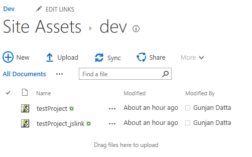
- Copy testProject.js and testProject_jslink.js to the “Site Assets” library under the “dev” folder.
- Press F-12 to open the browser console.
- Load the script
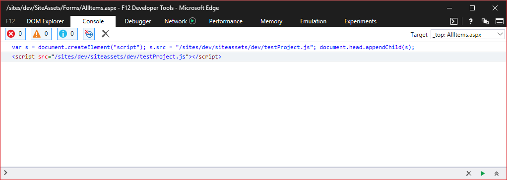 Note - The site collection I’m working out of has a relative url of “/sites/dev”
var s = document.createElement("script"); s.src = "/sites/dev/siteassets/dev/testProject.js"; document.head.appendChild(s);
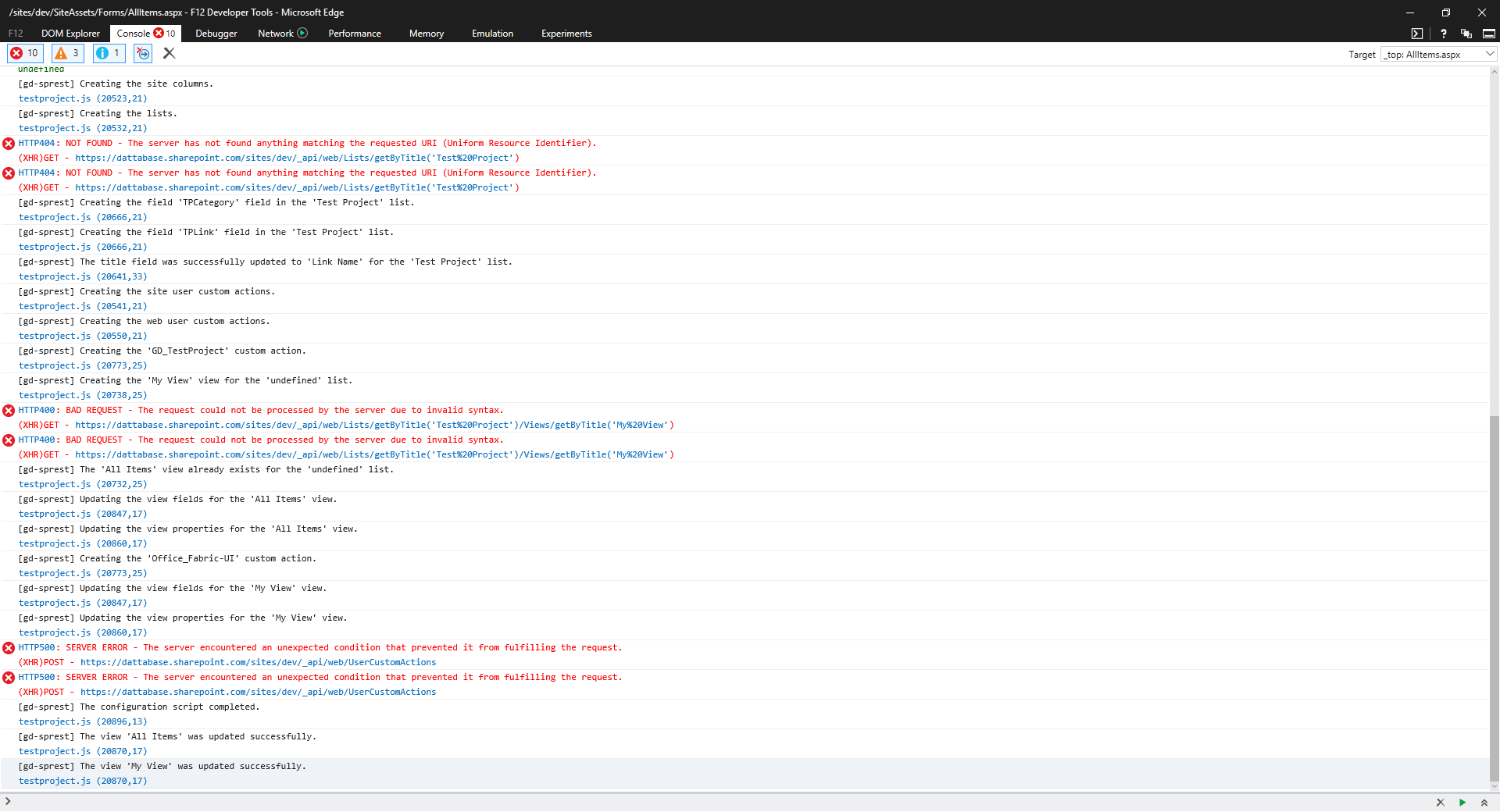
- Install the solution
TestProject.Configuration.install()
Demo
Refresh the page and view the “Test Project” icon in the suite bar or top ribbon. I’m testing against SharePoint Online, so I see it in the top ribbon. 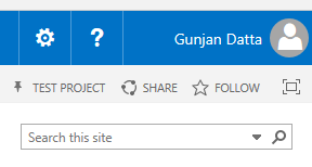 Note - I’m using an icon from the spCommon.png file
Accessing the “All Items” default list view, the view fields have been updated. 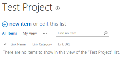
Accessing the “My View” custom list view, you’ll see a message saying the list is empty. 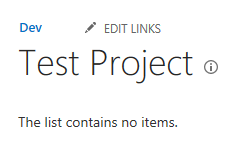 Note - In order to use JSLinks in SharePoint Online, you have to edit the list settings and set the “List Experience” value to “Classic experience”
Clicking on the top ribbon link will display the same message. 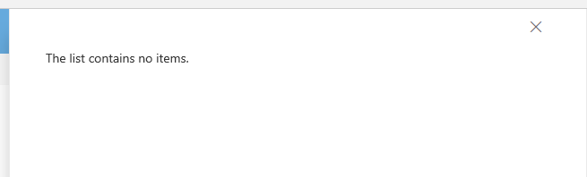
After adding some data, the custom list view will display the links. 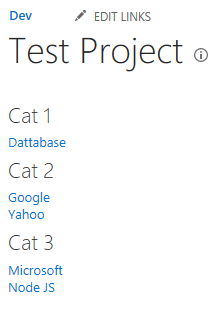
Clicking on the top ribbon link, the panel will display the links. 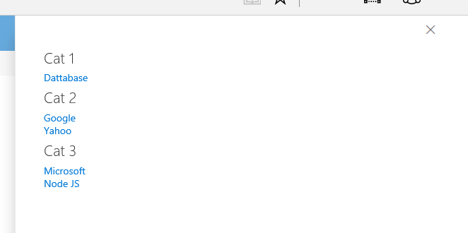
Edit a WebPart Page, and add the “AAA Test” webpart to it. It will render the same html as the list view. Note - The WebPart will be under the “Miscellaneous” category 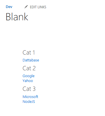
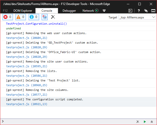
Uninstall
- Press F-12 to open the browser console.
- The custom action has the script already loaded, so all we need to do is uninstall the solution.
TestProject.Configuration.uninstall()